How to Choose Living Room Curtains and Drapes: A Buyer's Guide
Start Here: The Five Decisions Behind Every Good Curtain
Curtains look like a one-step purchase and behave like a five-step one. The panels that frame a window beautifully in a showroom can hang short, gap at the sides, or wash out against your walls once they are up at home. The difference almost never comes down to taste. It comes down to a short sequence of measurable decisions made in the right order.
This guide walks through how to choose living room curtains and drapes the way a designer or a workroom does: length first, then width and fullness, then fabric and opacity, then header style, then color. Get those five right and the rest is detail. Get them wrong and no amount of expensive fabric will rescue the result.
A note on how this guide was built, because it matters for trust. We did not hang these panels in a test apartment or run light-meter readings ourselves. This is a research-based guide. The measuring rules, fabric behavior, and styling principles below are synthesized from interior-design publications, drapery workrooms, and fabric specialists, and every load-bearing claim links to its source so you can check it. Where we reference specific products from our living room curtains and drapes coverage, we are pointing to real listings, not staging a hands-on review we did not do.
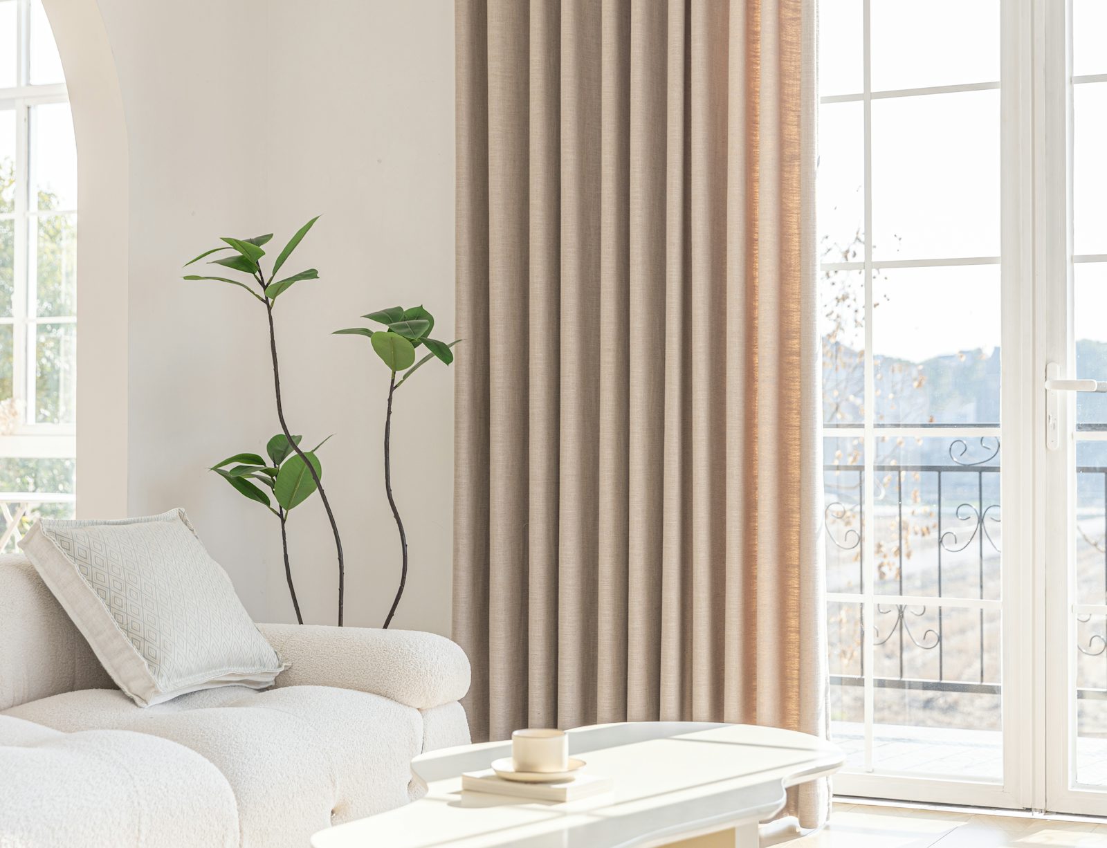
Floor-length panels and a high rod are what make a window read as tall and intentional.
Decision One: How Long Should Living Room Curtains Be?
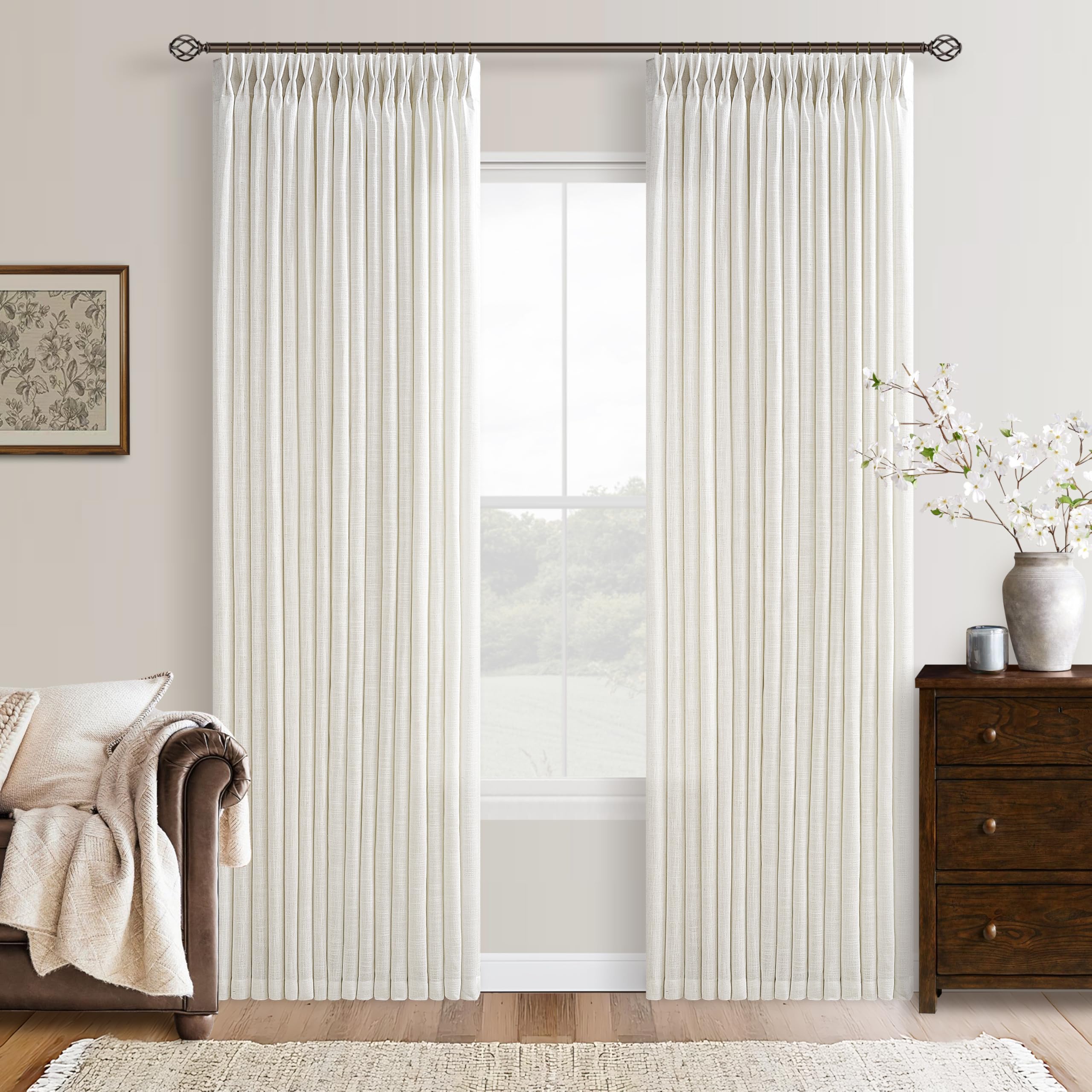
Length is the single decision that does the most to make curtains look custom or look cheap, so it goes first. For a living room, the default that almost always reads as intentional is floor length.
Floor length is the living-room standard
Panels should hang to roughly half an inch to one inch above the floor. That gap keeps the hem from dragging and collecting dust while still looking full-length. The guidance from NICETOWN's measuring guide is to measure from where the rod will sit down to the floor, then subtract that half-inch to inch so the fabric does not puddle or drag.
Two other lengths exist, and both are usually wrong for a main living space:
- Sill length stops about half an inch above the window sill. It looks neat and tailored but leaves the whole wall below the window bare, which tends to read as a kitchen or utility treatment rather than a living room one.
- Apron length drops four to six inches below the sill. It covers the sill and looks deliberate, but it still cuts the window off mid-wall instead of carrying the eye to the floor.
If you want a softer, more formal look, you can deliberately order panels an inch or two longer so the hem just kisses the floor, sometimes called a "break." That is a style choice, not a mistake. What you want to avoid is the accidental version: panels that float several inches off the floor because the height was guessed rather than measured.
Floors are rarely level, so measure three times
One detail trips up almost everyone doing this for the first time. Floors and ceilings are rarely perfectly level, so a single measurement can leave one panel kissing the floor and the next one hovering. Homes & Gardens recommends measuring the drop on the left, the middle, and the right of the window, then using the shortest of the three as your final length. It is a thirty-second habit that prevents the most common length error there is.
Decision Two: How Wide Should the Curtains Be?
Width is where curtains earn the word "drapes." A panel that is exactly as wide as the window will look thin and stretched when closed, with no folds. The fix is fullness: ordering more fabric width than the window itself.
Aim for two to three times the window width
The working rule is that your total curtain width should be roughly two to three times the width of the window so the fabric gathers into folds rather than pulling flat. Deconovo's measuring guide frames it as taking the rod width as your base and multiplying by a fullness ratio, commonly 1.5 to 2 times, so the panels form natural folds when drawn closed.
In practice:
- For a light, casual look, aim toward the lower end (around 1.5 to 2 times the width).
- For a lush, formal look with deep folds, push toward 2.5 to 3 times.
If you are buying two panels for one window, remember the total goes across both. Divide the target total width by two to get the width each panel needs to be.
Let the panels stack off the glass
Fullness is only half the width story. The other half is where the panels sit when they are open. You generally do not want curtains stacking on top of the glass during the day, because that blocks light and view and makes the window look smaller. The standard advice is to extend the rod six to twelve inches past the window frame on each side so the open panels rest against the wall instead of the glass. The same extension also makes the window read wider, which is often a welcome side effect in a living room.
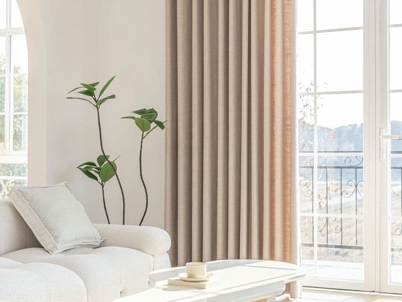
Generous width and a high rod let light-filtering linen fall in soft, even folds.
Decision Three: Where Does the Curtain Rod Go?
Length and width assume a rod position, so it is worth locking that in before ordering. Rod height changes the apparent proportions of the entire wall.
Hang high and wide
The standard placement is six to ten inches above the window frame. Hanging the rod higher than the frame, rather than right on top of it, draws the eye upward and makes the ceiling feel taller and the window grander. Designer Monica Benavidez's curtain-length guide is one of many that treats "hang it higher than you think" as the default move for making a room feel larger.
A few practical points to hold together:
- The higher you mount the rod, the longer your panels need to be, because length is measured from the rod down. Decide rod height first, then measure the drop.
- Pair the high mount with the wide mount from Decision Two. High-and-narrow looks awkward; high-and-wide looks designed.
- If you have crown molding or very high ceilings, you do not have to go all the way to the ceiling. Splitting the difference between the window frame and the ceiling usually looks more balanced than mounting right under the crown.
This is one of the cheapest upgrades in the whole process. The same panels, moved up and out a few inches, change how the entire room is read.
Decision Four: What Fabric and Opacity Do You Actually Need?
Now the fun part, and the part where people overspend on the wrong thing. Fabric choice is really two questions stacked together: how much light do you want to let in, and what texture and weight do you want. A living room is usually a daytime, light-friendly space, which points you toward different fabrics than a bedroom would.
Match the opacity to how you use the room
Opacity is the functional decision. Get it right and the fabric choice gets much easier.
- Sheer / light-filtering panels (voile, loose-weave linen) soften and diffuse sunlight without darkening the room. They suit living rooms that you mainly use in daylight and where you want brightness and a view. Deconovo's fabric guide notes that linen in particular filters light into a gentle glow rather than blocking it.
- Blackout panels are built to stop light almost entirely. They are the right call for media rooms, west-facing rooms with harsh afternoon glare, or any living room that doubles as a guest sleeping space. The trade-off, as fabric specialists point out, is that they really do darken a room, so be sure you want that before committing.
A common and effective compromise is to layer: a light-filtering panel for the daytime view plus a heavier or blackout panel you can draw when you need darkness or privacy. That layered approach is also why many living rooms end up with two rods or a double-track.
The four fabrics worth knowing
Once opacity is settled, texture and weight come down to a handful of materials. Drawing on the fabric breakdowns from Deconovo and Two Pages Curtains:
- Linen. Made from flax, with a natural slubby texture that adds character. It filters light beautifully and feels relaxed and elegant, which is why it is a living-room favorite. The catch is that it wrinkles, and some linens are recommended for dry cleaning. If you love a crisp, pressed look, linen will frustrate you; if you like an easy, lived-in drape, it is ideal.
- Cotton. Versatile, lightweight, durable, and easy to care for. It gives moderate light control and a clean, casual look that works in most rooms. It wrinkles somewhat and benefits from occasional ironing, but it is the low-drama all-rounder.
- Velvet. Heavy, plush, and light-absorbing. It darkens a room, muffles sound, and reads luxurious, which makes it a strong pick for formal living rooms or home theaters. The downsides are weight, cost, the way the pile attracts dust and pet hair, and the fact that it typically needs professional cleaning.
- Polyester and blends. Often the most affordable and the easiest to wash, and frequently the base for blackout linings. They lack the character of natural fibers but win on practicality and price.
For a typical living room that you want bright and inviting, linen, cotton, or a sheer points you in the right direction; reserve velvet for when you specifically want drama and darkness.
What fabric is best for living room curtains?
There is no single best fabric, only the best match for your priorities. If you want light and airy, choose loose-weave linen or cotton. If you want drama and darkness, choose velvet or a blackout panel. If you want low maintenance, choose cotton or a polyester blend over linen or velvet. The product our cluster covers on the light-and-airy end is a natural cream linen pinch-pleat panel reviewed here, which is a good illustration of the relaxed, light-filtering category in practice.
Decision Five: Header Style, Color, and the Finishing Details
With the structural decisions made, two style decisions remain: how the top of the curtain attaches to the rod (the header), and what color it is. Both are easy to overthink, so here are the rules that actually matter.
Pinch pleat vs grommet vs rod pocket vs tab top
The header style sets the formality and also affects how well the panels block light and how easily they glide. Pulling from the header guides at Three Girls and EaseEase:
- Pinch pleat. The most tailored and formal look, with neat, uniform folds sewn into the top. Because the fabric overlaps in deep, consistent folds, pinch pleat offers some of the best light control and a tidy "stack" when open. The trade-offs are that it uses more fabric, costs more, and benefits from careful handling. It is the classic living-room and drapery choice for a reason.
- Grommet. Large metal rings let the panel glide easily and fall in clean, modern folds. It is casual, contemporary, and great for curtains you open and close daily. The downside is light control: the rings leave gaps at the top, and grommet panels have the least stack-back and added fullness, so they do not seal out light as well.
- Rod pocket. A sewn channel the rod slides through, giving a gathered, traditional, slightly ruffled top. It is inexpensive and easy to install, but the fabric snags and bunches when you slide it, which makes it best for stationary side panels rather than curtains you actually draw.
- Tab top. Visible fabric loops over the rod for a relaxed, rustic feel. Charming in sunrooms and casual spaces, but the gaps between tabs let light leak through, so it is a poor choice anywhere you need darkness.
For a living room you want to look polished and control light well, pinch pleat is the safe, designer-default header; grommet is the modern, lower-effort alternative. Both products in our living room curtains and drapes lineup use a pinch-pleat header, which is part of why they read as drapes rather than basic panels.
How to select curtain color for a living room
Color is where buyers freeze, usually because they are trying to "match" something exactly. You do not have to. The principles that keep coming up across designer guides like Homes & Gardens and EaseEase's color guide are simpler than matching:
- Coordinate, do not clone. Curtains do not need to be the exact shade of your wall. Pulling a color from your sofa, rug, or throw pillows ties the room together without looking like everything came from one swatch.
- Use the 60-30-10 rule as a sanity check. A common interior-design ratio puts roughly 60 percent of a room's color on the walls, 30 percent on large elements like curtains, and 10 percent on accents. It is a quick way to decide how bold your curtains should be: if the walls are doing a lot, calm curtains balance them; if the walls are neutral, curtains can carry color.
- Neutral walls invite a choice. Against white, beige, or gray walls you can either keep curtains tonal and quiet for a calm, expansive feel, or introduce a bold curtain color (navy, terracotta, emerald, mustard) to make the windows a focal point. Both are valid; pick based on how much energy you want the room to have.
- Let light levels guide value. In a bright, sunny room, deeper curtain colors help control glare and add coziness. In a darker room, lighter and semi-sheer colors keep things open and airy.
If you want a low-risk answer: a soft, warm neutral (cream, oatmeal, greige) in a light-filtering fabric flatters almost any living room, never fights the furniture, and is the reason "natural cream linen" shows up so often in living-room listings.
Modern and luxury looks without overspending
Two of the things buyers search for most, "modern" and "luxury" curtain designs, are mostly produced by execution rather than by a special fabric. A modern look comes from clean headers (grommet or crisp pinch pleat), solid or subtly textured fabrics rather than busy patterns, and a high, wide rod. A luxury look comes from three things that cost nothing extra to specify: generous fullness so the folds are deep, floor-grazing length, and a rod mounted high. You can spend a fortune on fabric and still look cheap if the panels are skimpy and hung low; you can spend modestly and look custom if the proportions are right.
Putting It Together: A Quick Measuring Walkthrough
Here is the whole process condensed into the order you should actually do it in, drawing the steps from the measuring guides cited above (NICETOWN, Deconovo, Homes & Gardens):
- Decide rod height. Mark a line six to ten inches above the window frame, or split the gap to the ceiling on high walls. This sets everything else.
- Decide rod width. Plan to extend six to twelve inches past the frame on each side so open panels clear the glass.
- Measure the drop in three places. From the rod line to the floor on the left, middle, and right. Use the shortest. Subtract half an inch to one inch for floor-clearing length.
- Calculate width. Take the rod width and multiply by 1.5 to 3 depending on how full you want it. For two panels, divide by two.
- Choose opacity, then fabric. Light-filtering for a bright daytime room, blackout for darkness, layered if you want both. Then pick linen, cotton, velvet, or a blend to match your texture and care preferences.
- Choose header and color last. Pinch pleat or grommet for a living room; coordinate the color with your furniture and use 60-30-10 to gauge boldness.
Do these in order and you will not end up with the two classic mistakes: panels that are too short, or panels that are too narrow to close into folds.
How to Pick Curtains for a Living Room: Common Pitfalls
A few failure modes show up again and again, and all of them are avoidable once you know the rules above.
- Hanging the rod on the frame. It makes the window look squat and the ceiling low. Hang high.
- Buying exactly window-width panels. They look like flat sheets when closed. Buy for fullness.
- Guessing the length. Floors are not level and rods are not always where you assumed. Measure the drop three times.
- Choosing fabric by looks alone. A gorgeous linen you have to dry-clean, or a velvet that sheds onto your dark sofa, is a daily annoyance. Factor in care and light before texture.
- Matching the wall color exactly. It often flattens the room. Coordinate with furniture and accents instead.
Next Steps and Related Reading
Once you have your five decisions, the last step is choosing the actual panels. For specific picks, ranked and compared, see our pillar guide to the best living room curtains and drapes, which applies everything above to real products. If you have decided you want the relaxed, light-filtering look, the pinch-pleat linen living room curtains review walks through a natural cream linen panel in detail, including how it behaves on the wrinkle and light-filtering trade-offs discussed here.
Choosing living room curtains and drapes is not about finding a magic fabric. It is about getting length, width, rod position, fabric, and header right, in that order, and letting color be the easy, expressive part at the end. Nail the measurements and the proportions, and even an affordable set of panels will look like they were made for the room.
Related Posts

Insights — Are Outdoor Patio Cushions Waterproof? What "Water-Resistant" Really Means
Most outdoor patio cushions are water-resistant, not waterproof — and that's a feature, not a flaw. Here's what the labels really mean, why foam matters as much as fabric, and how to keep cushions dry and mildew-free.